


Tools
-
Figma
My Role
-
UX Research
-
Ideation
-
Sketching
-
Prototyping
-
Testing
Timeline
-
5 days (Modified Google Venture Design Sprint)
Problem
Parents want to find books that are fun, age appropriate, and that have educational value. However, they are spending more time looking for stories and skimming them for length and content than actually reading to their children.
Solution
To assist families, I redesigned the app and its method for categorizing stories. This, coupled with age filters and an easily accessible search bar make finding and reading stories quicker and more enjoyable for families.
Design Sprint Process
Day 1:
Understand & Map
Day 2:
Lightening Demos & Sketch
Day 3:
Decide & Storyboard
Day 4:
Prototype
Day 5:
Test
Day 1:
Understand & Map
Solution
The current version of the TinyTales app poses challenges to its users. According to company research, parents have reported it is difficult and time-consuming finding the right story. The company is primarily focused on how users select a story.
TinyTales already conducted a series of user interviews; so, to help organize my thoughts, I created the user persona below to reference during the design process.
Dan
Father of Dylan (6) and Nina (4)
I usually let my kids pick a topic, then I try to scan through the book to see how long it is. Sometimes we want a quick book before bed...if it's long, I usually have to stop reading before it's over.

Anna
Mother of Olivia (5) and Cara (3)
I can tell when my girls get bored with the same stories over and over again - but it takes so long to find a new one that they'll enjoy as much as the 'classics'.

Lindsey
Mother of Macy (7)
The main thing we look for is a specific topic. Sometimes it takes a while to find the right story to read. Recently, she wanted to read about giraffes - we had to do a lot of searching to find a good story.

User Persona
To make ensure my decisions in the design process are user-centered, I wanted to have a clear understanding of who TinyTales users are. Using what I learned from company research and interviews, I created a user persona to represent who I will be designing for - Meet Claire!

From Insight to HMW
With background research and a user persona complete, it was time to pivot to a problem-solving mindset. I used the insights gained from research and my understanding of Claire's needs to create Point of View (POV) statements to frame the problem from the user’s perspective. I used these POV Statements to identify How Might We (HMW) questions which would fuel my process of brainstorming solutions.
Parents like to select stories that they can finish in a single sitting.
To know the length of stories.
Claire needs to know how long a story is because she likes to select stories she can finish in a single sitting.
Offer Claire insights on story length?
Parents like to know what content or themes are covered in stories.
To know what stories are about before reading.
Claire needs to know what stories are about before reading them because she prefers to select stories on specific topics or themes.
Inform Claire about story content and themes?
Parents like to quickly find books on topics that interest their children.
To have a way to easily search for books based on topic.
Claire needs to have a way to search for books based on topic so she can quickly find books that interest her children.
Help Claire find stories on specific topics quickly?
Parents like to allow their children to search for stories to read.
To have their children engaged in the story selection process.
Claire needs to have her children engaged in the story selection process because she wants them to search for stories to read.
Help Claire's children feel engaged in the story selection process?
INSIGHT
Parents want to know the story they are selecting for their child is age-appropriate.
NEED
To know the age-range associated with available stories.
POV
Claire needs an age indicator for available stories because she wants to be certain the story she selects is appropriate for her children.
HMW
Assist Claire in finding stories for her children that are age-appropriate?
Mapping it Out
Next, I wanted to learn how users would interact with the Tiny Tales website. I started to explore how Claire would engage with Tiny Tales based on the goals outlined in my user persona by creating a task flow.
Claire wants to find a sports book for both of her children to enjoy together.

Day 2:
Lightening Demos & Sketching
Competitive Solutions
To prep for the Lightning Demos portion of this project, I researched what other companies are doing to assist users in finding goods or services easily. Once this was done, I noted the strengths of each site regarding its display of content and search functions.
Initially, I looked at other reading apps such as Apple Books and Audible. I then broadened my research to incorporate the Disney+ app since it also houses a large body of content that must be easily searched without being overwhelming.

Apple Books
-
Users can search for books by genre or by using the search icon located in the bottom navigation
-
Simple and streamlined navigation

Audible
-
Users can select the search icon at the top right of the screen or click the 'Discover' icon to find books
-
Multiple methods for searching for a book or author available to user

Disney+
-
Users can select the search icon at the bottom of the screen or choose from the selections listed on the homepage
-
Engaging visuals to peak child interest
Crazy 8's
With a clearer view of my user's wants, needs, and pain points, as well as understanding how other companies organize content for their users, I began sketching my own solutions.
To generate a number of ideas quickly, I used the Crazy 8’s strategy. This required me to sketch eight different solutions within a span of eight minutes.

Primary Solution
From my Crazy 8’s sketches, I created a single screen with one primary solution. During my competitor analysis, I appreciated apps that offered users multiple options for finding what they wanted. To provide TinyTales users with this benefit, I decided to combine a couple solutions from my Crazy 8’s sketches into one screen.

Three Panel Board
With my primary screen complete, I then sketched the two screens that follow it to provide myself more context while designing.

Day 3:
Storyboarding
Illustrating the Problem & the Solution
My intention during the storyboarding process was to depict potential real-world challenges parents like Claire encounter when selecting a story and how my solution will help.
In this scenario, our parent user, Claire, is challenged to find a story that will satisfy her two very opinionated children.


Day 4:
Prototyping
Building the Solution
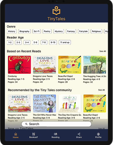
With only a week to bring this project full circle, it was essential to build out my sketch solution in the form of a clickable prototype. While this prototype is not fully functional, it offers me an opportunity to fully communicate my design decisions based on user research.
-
Genre and age filters allows user to narrow their search.
-
Reading age and story length visible before making a selection.
-
Search bar allows users to find specific titles, authors, or topics.
.png)
-
Layout resembles what users see in other online reading apps.
-
Stories divided into sub-categories for easier searches.
-
Colorful story thumbnails engage young readers to make selections.
Day 5:
Test
Testing the Parents
In preparation for testing, I reached out to a number of friends, family, and co-workers who have children on day one of the sprint. Knowing that I was working within a strict five day cycle, it was extremely useful to select and schedule my testers early in the process.
Users were ultimately selected along the following criteria:
-
Parents (male or female)
-
Have children aged 7 years old or younger
-
Read to or with their children three times per week
Users were presented with a single scenario:
Your child has an interest in pirates and really wants to read a pirate story today. How would you use the TinyTales app to do this?
User Quotes
I don't think genre filters are as helpful for children's stories. One story could cross many genres.
It didn't occur to me to use the search bar. It was blocking my view of the screen. Maybe it should be in the bottom navigation.

We need to select a story quickly and finding the right age-rage fast matters. I would elevate the age filter more.
What does 'Bookshelf' mean? If these are books that we set aside maybe rename it to 'Saved'.
User Feedback
After speaking with users, I documented each person's feedback into a prioritization matrix. The categories breakdown into the following categories:
-
Critical (impacting 4-5 users)
-
Major (impacting 3 users)
-
Minor (impacting 2 users)
-
Normal (impacting 1 user)
CRITICAL
-
Testers didn't notice the age filter.
-
SOLUTION: Elevate age filter on screen and make them stand out from the background.
CRITICAL
-
Testers didn't notice the search bar until later.
-
SOLUTION: Change search function to an icon at top right or nest it in the bottom navigation.

CRITICAL
-
Testers tried using the genre chips to filter books and later said it wasn't very helpful to finding stories.
-
SOLUTION: Minimize genre filters or make it collapsible so users are not immediately drawn to it.

MAJOR
-
Users didn't scroll down because they were unaware that there was more information on the page.
-
SOLUTION: Reduce image size and have content on lower portion of screen peeking up.
Next Steps
In staying true to the parameters of this project, I chose not to iterate the TinyTales prototype. Any future changes would be those items deemed Critical and Major in the prioritization matrix, including:
#1 Eliminate the genre chips or collapse them into an expandable filter
#2 Elevate age filter on page and change its color to make it stand out
#3 Move the search bar into the bottom navigation
#4 Reduce image size on story information page so users know it is scrollable
Reflection
My greatest challenge during this 5 day project was getting carried away designing features and color schemes. I stopped myself a number of times when it was clear I was designing based on aesthetics and not for user ease.
Overall, I really enjoyed the fast pace of the design sprint and found a number of useful ways to move through the design process.
Check out more of my work


Level Up

.png)
Breakaway


BoardSpace