


Tools
-
Figma
-
Miro
-
Optimal Workshop
-
Marvel
My Role
-
UX Design
-
UX Research
-
Branding
Timeline
-
6 Months
Problem
Women are statistically less likely than men to get the appropriate amount of daily exercise recommended by the CDC.
.png)
Solution
Research led me to the conclusion that a feature-rich exercise app with the capacity to connect users with personal trainers, sporting leagues, and on-demand videos is the best way to engage women and keep them committed to their personal health goals.
Unlike competitors which only accomplish one of the above mentioned functions, Level Up offers users the chance to streamline their exercise activities into a single easy-to-use app.
Impact
During the final round of usability testing, I took note of two key performance indicators (KPIs): user satisfaction and ease of operation or experience. From this, I deduced that users were pleased with features the app offered and felt using it was a smooth and hassle-free experience.
These positive indicators reveal that Level Up will have high rates of user retention and brand loyalty in a heavily saturated market.
Design Process
.01 Empathize
.02
Define
.03
Ideate
.04
Prototype
.05
Test
.01 Empathize
Research revealed 3 primary constraints acting as barriers to consistent exercise and guided the project's focus.
Initial Hypothesis
The prevalence of harassment directed toward women in gym and recreation spaces is well documented in academic studies and social media. I, therefore, assumed this was the primary reason why women are less likely to get enough exercise.
Research
After doing secondary research and corroborating my initial assumptions with academic and social media sources, I conducted interviews with women to get their first-hand perspective.
I sent out an initial Google screener survey and interviewed five respondents. Each was between the ages of 20-50, working full-time, exercise at least three times per week, and exercise in a mixed-gender setting currently or in the past.
Link to Google screener survey here.
Synthesis
To process the information from my interviews, I used an affinity diagram. This allowed me to group information into distinct categories based on their similarities.

Key Takeaways
I was surprised to find that although all of my interviewees reported instances of negative interactions with men while exercising, none of them felt it was a hinderance to continuing the activity.
Instead, all women felt the primary hinderances to regular exercise were:
Time
Cost
Finding a trainer/group
Danielle
I think if I had a community that was like-minded it would be easier to maintain the discipline you are trying to achieve.

Irene
It's hard. I think that everyone who has kids knows the struggle.

Heather
If I had more heavy weights incorporated in my regimen, functionality wise, my body would be better. I want to maintain my strength while aging.

Pivot!
Insights from these interviews led me to change the direction of my initial design plans. Rather than focusing on how to help women feel encouraged to continue exercising independently via a virtual platform, I expanded the scope of the project to include the ability to search for and book appointments with personal trainers as well as give them the ability to find and participate in group sports while still offering online exercise videos for independent exercise.
Competitive Analysis
For this portion of my research, I focused on the apps that my interviewees noted they were currently using for exercise. This allowed me to better understand the strengths and shortcomings of each app in assisting my users with staying true to their exercise goals.
View full heuristic and competitive analysis here.

.02 Define
Utilizing "How Might We" statements and a persona to focus design solutions on user needs and challenges.
From Problems to Solutions
After identifying the primary problems of my target audience, it was time to shift my focus to creating solutions. For this, I created How Might We statements (HMWs). HMWs keep the user's core needs at the focal point of my solutions and my future designs.
How Might We...
-
Assist users in finding experienced personal trainers without requiring a gym membership?
-
Provide users with a platform to easily find local sports groups to keep them engaged in a social exercise setting?
-
Connect users with a larger exercise community to keep them motivated and inspired?
User Persona
I used concrete information from competitive analysis and interviews to create a visualization of my future user in the form of a user persona that would help me define the project.
View larger user persona here.

.03 Ideation
Brainstorming solutions and creating a user flow to ensure a smooth user experience.
Generating Ideas
With a better understanding my users and their problems, I set out to create solutions using a number of different activities.
-
Brainstorming activity - to generate ideas
-
Feature Prioritization Matrix - to categorize and prioritize ideas
-
MVP Stories - to hone in on specific functions that solve user problems
-
Red Routes - Identify critical tasks that deliver maximum value to users
With my red routes identified, I could move on to creating a Site Map which allowed me to better visualize the main pages and general architecture of the app.
User Flow
Creating a user flow for each red route was essential in making sure users would move through the app with ease.
View complete user flow here.

.03 Design
Using sketches, guerrilla testing, and wireframes to refine usability and visual consistency.
Paper Prototype & Guerrilla Testing
Designing a paper prototype allowed me to quickly bring my ideas to life. I uploaded my sketches into the Pop Marvel app and conducted guerrilla usability testing to make sure I was not missing a crucial element in my design.
View complete sketches here.
User Feedback
-
Rename 'Train' icon for user clarity

-
Clarify Trainer Intake page with description to make it obvious why these questions are being asked

-
Incorporate a suggested videos page once users complete an exercise
Wireframing
With feedback from my guerrilla testers in mind, I moved forward in creating wireframes. When it came to deciding on the layout, I modeled my screens after the Nike Training Club and Peloton apps since Jakob's Law indicates that users prefer sites to look and function like ones they are already familiar with.
See complete wireframes here.

-
Homepage resembles what users are used to seeing on Nike Training Club and Peloton apps.
-
Utilized full calendar for appointment selection to allow for maximum user control in building their ideal schedule.

-
Included page explanation so users understand what is being asked and why it matters as requested during guerrilla testing.

Branding
To prepare for the next stages of design, I needed to solidify Level Up's brand and core identity.
Level Up was built to inspire and encourage its users to push through the physical and mental barriers that hold them back. With that in mind, I set out to curate a color palette that inspired feelings of strength, enthusiasm, friendliness, decisiveness, and accessibility.
Color Scheme
Seasalt
To invoke feelings of simplicity
#F9F8F8
Atomic Tangerine
To ignite energy and excitement
#F29322
Black
To make users feel powerful
#050505
Electric Blue
To inspire calm and friendliness
#F00B2CA
Midnight Green
To instill feelings of trustworthiness
#2D5562
.04 Prototype / .05 Test
Leveraging feedback to build a prototype for testing and refining the product.
Once a functioning clickable prototype was built it was time for another round of testing. For these tests, I returned to my target audience and asked them to complete the following tasks:
#1 Select a personal trainer and book a session
#2 Find a sport and sign up
#3 Select an exercise video
Users were then asked to offer their honest feedback on the app, its appearance, and its functionality.
See the initial prototype here.


I'll type a message to my trainer here.

Was the time I clicked accepted?
How I Decided What to Focus On
I documented user feedback into a usability test report and then into a prioritization matrix. The matrix was particularly useful because it helped me prioritize issues as:
-
Critical (impacting 4-5 users)
-
Major (impacting 3 users)
-
Minor (impacting 2 users)
-
Normal (impacting 1 user)
Future iterations of the prototype would focus exclusively on issues categorized as Critical and Major in order to manage the time and scope of the project.
View the usability test script, interviews, and notes here.
View the usability test report and complete priority matrix here.
View the redesigned prototype here.
User Concerns and Issues as Percentages
60%
Want the Sports page to scroll more easily
100%
Found the text box purpose unclear on the Booking page
60%
Uncertain if appointment time selection was accepted
From Feedback to Iteration
Original:

Update:
-
Critical Insight: Users incorrectly tried typing a message to their trainer.
Solution: Text box replaced with text button for users who need to message their trainer.

User Insights & Solutions:
-
Major Insight: Users unclear if the time they selected was accepted.
Solution: Color differentiation between buttons increased.
Solution: Date selection shown once chosen to instill user confidence.
Original:
Update:

-
Major Insight: Users feel the sport description is blocking their view of more important information and want it to scroll away.
Solution: Scrollable area of the page increased for easier readability.

Prototype Test, Take Two!
To ensure I solved earlier usability problems, I conducted another round of testing with a new set of five users within my target audience.
Following the same format as before, I placed their feedback into a prioritization matrix.
View the retest notes and usability test report here.

User Experience Gains
40%
Increase in user satisfaction with Sports page scrollability
100%
Reduction in user confusion by removing text box on Trainer Booking page
40%
Improvement in user certainty with time selection displayed
New Areas for Innovation
90%
Request a workout summary after completing each video
60%
Prefer on-screen booking confirmation instead of waiting for an email
80%
Want activity recommendations
Taking Action on Feedback
Original:
Update:
User Insights & Solutions:
-
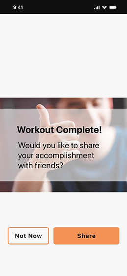
Critical Insight: Users noted that they want a review of their workout once they're done. They like the idea of being able to track their progress.
Solution: The redesigned page includes a summary of the workout they just completed with a breakdown of muscles engaged.
Solution: The page includes data for users to track their exercise progress.
-
Critical Insight: Users are interested in being able to find similar classes or classes that will compliment their exercise.
Solution: The new UI includes a list of class suggestions for users to continue their cool down or to save for later.


Original:

Update:
User Insights & Solutions:
-
Major Insight: Users want a summary of the booking rather than having to wait for an email confirmation.
Solution: The new design now summarizes all booking details while also offering the user a confirmation number and activity location information.
-
General Insight: Interviewees said they are interested in building an exercise community.
-
Critical Insight: Users want recommendations about other sports or leagues that have openings or that are starting soon.


Solution: Users have the chance to connect with new people before starting a new activity.
-
General Insight: Interviewees mentioned that having one app to track their activities would be useful.
Solution: Users can use the app to track and manage their exercise schedule.
Solution: The redesigned page lists other activities in the user's area that have openings or that might interest them.
Design, Redesign, Repeat
To improve the app for the benefit of users, I continued to tweak the designs of several pages by asking myself how might this screen be more engaging for users. To answer these questions, I referred to previous user insights to form solutions.
The following screens are iterations of the exercise video page.
Original:

User Insights & Solutions:
-
General Insight: Target users are in a hurry - how can the app help them find similar videos if this isn't what they want?
-
General Insight: Target users aren't interested in reading content. How might this section be more visually descriptive?
Update:


Solution: Tags allow users to find specific video content quickly and easily.
Solution: Icons help to break up content and make the page less overwhelming.
Solution: An interactive diagram allows users to engage with the app.

-
Interactive buttons included for users to learn what the muscle group is and why it needs strengthening.
-
Pop up appears when plus icons are pressed.

See the new and improved exercise video page in action...


Future Design Opportunities
An examination of areas for further development to improve functionality and user satisfaction
The final design of the Level Up app is simple yet effective at connecting users to personal trainers and the local sports community. But there's always room for improvement. To that end, I would include the following features:
#1
Pages dedicated to nutrition and stress management - catering to the holistic health of users
#2
Message Board to send support and kudos within the Level Up community
#3
Build out the Calendar page
Reflection
Identifying lessons learned during the design process.
Leading a UX/UI project from start to finish was an exciting challenge that allowed me to discover my strengths in research, interviews, and analysis. While I initially struggled with implementing my design ideas, I learned that persistence and patience helped me overcome obstacles, ultimately resulting in a strong final product. I've also learned the value of taking my time in the iterative process. Rather than expecting perfection right away, I understand now that for a team of one, time and pacing are essential.

Check out more of my work

.png)
Breakaway


TinyTales


BoardSpace